Hi, I'm HIMANK NAGPAL !
Scroll down to see my work
*This site is Under Construction :-)
Blue Collar workers staffing
Previously worked at Gigforce as a Product Designer, where I built design-focused solutions for blue-collar workers.
Led a design team of two.
Can share more details on call.
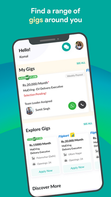
Gigforce was a digital platform designed to link businesses with skilled and pre-screened gig workers for temporary staffing needs. It provided flexible work opportunities, ranging from single-day assignments to extended engagements lasting several months. With a focus on convenience, Gigforce ensured that workers were readily available in their respective locations. The platform emphasized proper training, thorough documentation, and prompt payments, creating a smooth and professional experience for both businesses and gig workers.
The app had been created earlier to capture the high turnover rate among gig workers, resulting in decreased retention and a decline in business. However, the efforts had not been very successful.

Feedback and Reviews
-
The feedback received on the audit of this app as well as from the upper management was that it was very "complicated" and difficult to use.

Problem
-
Low user retention: Despite having an aesthetically pleasing app, usage numbers were low and dropping.
-
Complex app: The app was primarily in English, which users found difficult to understand. Even the name "Gigforce" was misinterpreted, with workers and managers referring to it as "G-I-G."
-
Limited cultural relevance: The app’s color scheme and design choices were not culturally intuitive for the target audience.
-
Preference for traditional methods: Users preferred traditional employment methods like contacting thekedaars (contractors) over using the app.
Team & My Role:
I was onboarded to simplify the existing app or create a new app to arrest the flow of user drop.
This Project was conducted with the team comprising of the Director of product, 1 product manager, the Design Team (2 designers who I led) , the Tech. Team of 6 ( comprising of developers and QA), and recruitment team comprising of head of operations and the 14 Team leaders under him.
My role was to...
Conduct primary and secondary research and design audit so as to understand the root causes of the problem.
Actively participate in ethnographic research to identify key value props for Gigers and onboarding process followed on ground.
Identifying pain-points of gig workers life and drive solution which is best-fit.
Design the new digital journey for Gigers with best possible UX.
Plan of Action
-
Redesign the app to improve user retention and usability.
-
Incorporate findings from ethnographic research and user interactions.
-
Adapt the app's design to align with users' cultural preferences and behaviors.
-
Empower thekedaars and team leaders as key decision-makers.
Discovery
Secondary Research
-
Insights from alumni and industry professionals highlighted the blue-collar economy's nuances, where leisure is a luxury, and trust in personal connections outweighs digital tools.
Primary Research
-
Ethnographic study:
-
A six-day visit to Selaqui operations to observe on-ground activities.
-
Lived with the head of operations and thekedaars to understand their processes.
-
Participated in morning and day shifts to observe the attendance, recruitment, and cash management workflows.
-
Define
-
Workers relied on trust-based relationships with thekedaars over digital platforms.
-
Many workers had tech-savviness but preferred apps like Facebook and WhatsApp in Hindi.
-
Issues like salary visibility, overwork, and non-compliant workforce were identified as pain points for both workers and companies.
Empathy Mapping
(To be added: Visual representation of user thoughts, feelings, actions, and needs)
User Personas
(To be added: Personas for workers, thekedaars, and team leaders)
HMW Questions
-
How might we design an app that feels intuitive and culturally relevant to blue-collar workers?
-
How might we ensure trust and reliability through digital interactions for thekedaars and workers?
-
How might we simplify attendance tracking and shift management processes?
Ideation
-
Shift the primary user focus from workers to thekedaars and managers.
-
Incorporate culturally intuitive design elements (e.g., color coding and language localization in Hindi and Hinglish).
-
Simplify the app’s core functionality into a Minimum Viable Product (MVP).
Wireframing
-
Collaborated with the Product Manager to create user and task flows.
-
Designed wireframes with a focus on simplicity:
-
One screen for one task.
-
Minimal scrolling to ensure visibility of all information.
-
User Interface (Solution)
-
Transitioned from cyan and magenta to red, green, blue, and yellow for cultural relevance.
-
Used swipe gestures for attendance tracking to reinforce seriousness.
-
Simplified forms and added intuitive icons to enhance usability.
Usability Testing
-
Conducted testing with 14 team leaders (thekedaars):
-
13 successfully managed workers using the redesigned app.
-
One faced challenges due to being unfamiliar with smartphones.
-
Revised Screens
(To be added: Screenshots or descriptions of revised designs if available)
Learnings and Future Scope
-
Learnings:
-
Simplified workflows and culturally relevant designs improve usability and retention.
-
Trust and empathy are crucial in building tools for blue-collar economies.
-
Collaboration with cross-functional teams enhanced understanding of user needs.
-
-
Future Scope:
-
Revise and elevate UI design to meet current standards.
-
Expand research to explore additional features like compliance monitoring and worker well-being.
-


